Worldwide Cancer Research
- User research
- User experience testing
- Website development and integration
- Copywriting
- Digital marketing and advertising
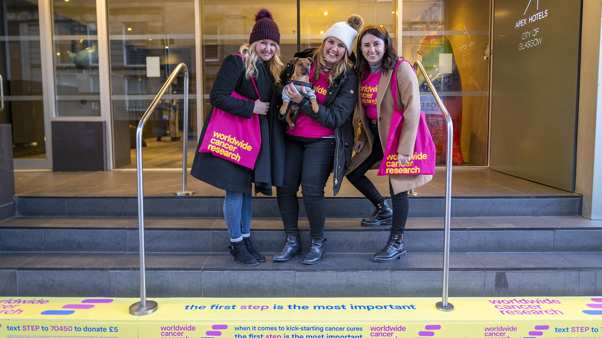
Being bold saves lives and we're proud to partner with such an amazing team and cause.
Part one
The brief
There's something extra special in partnering with a client with such an important mission as it gives you the opportunity to use your skills and energy on something that really matters.
So we were delighted when Worldwide Cancer Research asked us to become their digital agency, working alongside our pals Jam Hot who were working on a rebrand (and a TV ad) and Taylor Mackenzie who were brought in to work alongside us on market research and audience insight.
Part two
The work
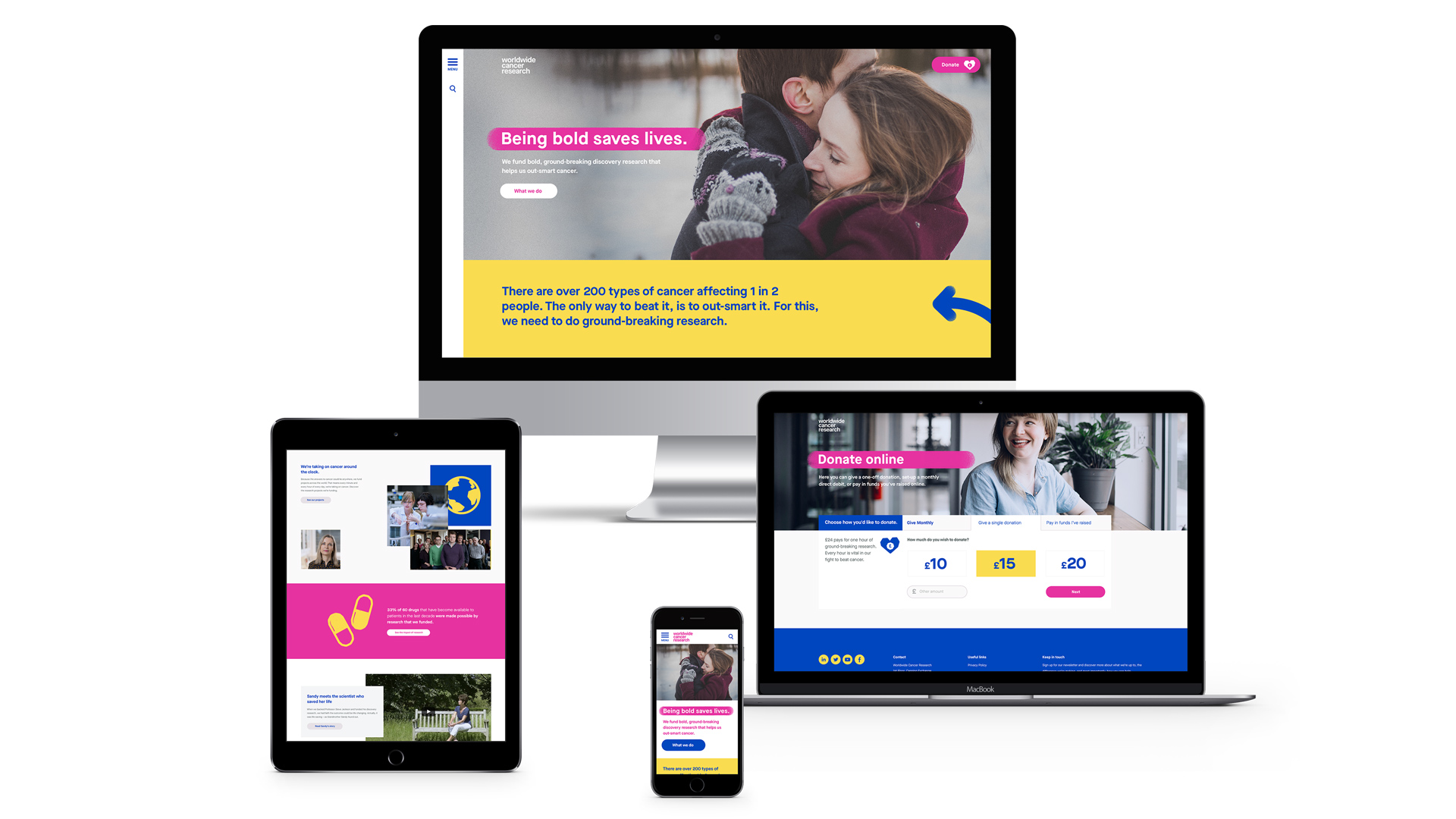
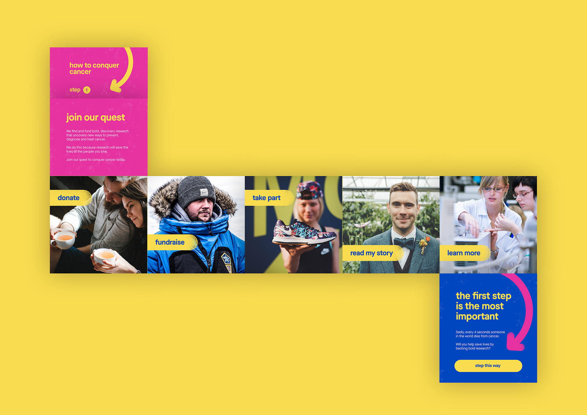
We focussed on bringing the digital journey to life, using the newly developed brand style to tell their story through a new website and a digital marketing strategy and campaigns.
Drawing on our experience of the charity sector we knew the importance of optimising the journey from offsite to onsite and the importance of making sure we converted supporters, fundraisers and donors from all organic and paid sources. That meant we had to really focus on the user experience of a seamless donation process and it elevated the importance of our copywriting to make fundraising activity exciting and engaging.
Have a look at the new look at the new website and brand and why not make a donation too while you are there.
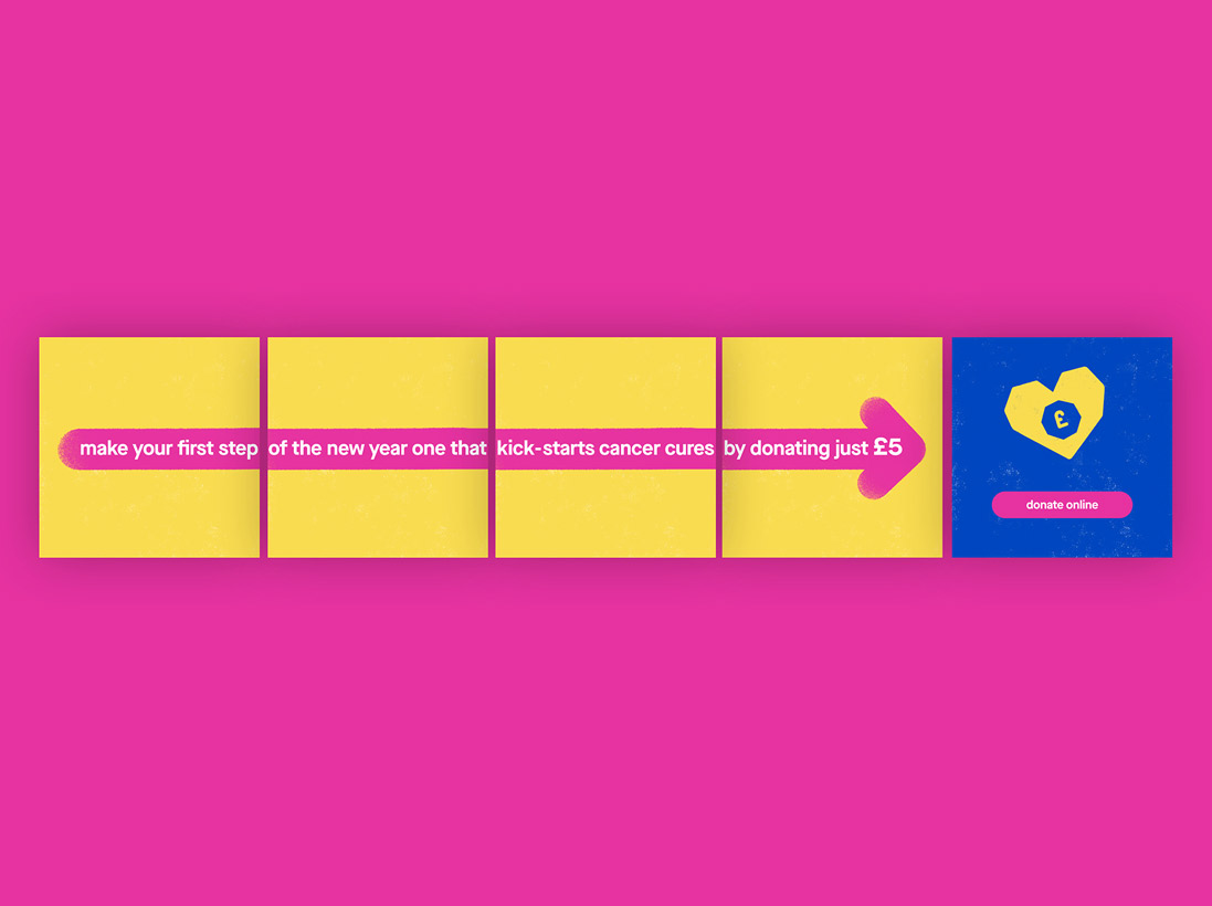
Digital marketing strategy, media and advertising creative
We soon became responsible for the strategy and delivery of their digital media spend across search, social and display for the launch campaign, as well as managing their Google not for profit grant.
A crucial element of any campaign (but even more important in the charity sector) is to ensure that every single penny of media budget is spent as effectively as possible to ensure the best return.
A/B testing and remarketing
As part of our ongoing work managing and optimising their digital channels and campaigns, we implemented a combination of A/B testing; to analyse what formats, creative and messaging yielded the greatest return with our audience, and a remarketing plan to re-engage warm audiences and encourage cash donation support to help meet our objectives and maximise the charities return on investment of all marketing activities.
Insights
Facebook “Instant Experience” ads delivered some of the best engagement and click through rates - the ability for users to immerse themselves in stories from Worldwide Cancer Research made a huge difference to their propensity to engage and donate.
Remarketing yielded great results! When we directed people to sections of the website that they previously showed an interest in; conversion rates were more than three times as high as when we sent people to generic campaign landing pages.
Using engagement-driven calls to action (e.g. 'learn more' rather than 'donate now') resulted in users organically sharing content at a far higher rate; proving that people need to build affinity with your brand before they will feel comfortable donating.
Part three
The results
The result was fresh new copywriting and visual design for their vibrant new brand and website — built in Umbraco with Salesforce integration to support donations. That, plus a successful launch strategy and campaign for a delighted client. Our work contributed towards a +18 positive shift in stewardship ranking for the charity. Donations via the website doubled based on the same period year on year with a 90% increase in donation value year on year.
Most importantly played out part in the answer to cancer, using our smarts and craft to contribute towards a very important cause and we'll be forever thankful for the opportunity to have done so.
+18
increased in position of stewardship ranking
90%
increase in donation value YOY
2x
increase in site donations

We initially chose to work with Three Part Story based on their technical and project management skills and close relationship with other partners but it was their creative approach that defined the site. It’s not easy to take a brand new brand on its first public outing - but they thrived on it and some of their work led to changes to the brand framework because it so strongly represented Worldwide.
The simplicity of style allowed our copy-led brand to breathe; their copywriting was so good it seemed they knew our brand better than us at times! Opting for a less traditional charity homepage with burger menu, allowed content to do the talking but the design didn’t sacrifice usability, it enhanced the user experience which in my experience is an incredibly difficult balance.
So invested in the creative approach taken to designing our site, that we worked with Three Part Story on our digital launch campaign across multiple channels and formats. We saw a significant uplift in donation value year on year (90%), number of donations (more than double) and a reduction in bounce rate - which demonstrates a more enjoyable site experience. We’ve also increased our stewardship ranking from 28 to 10 for cash donations in just the first month of go live. This is based on direct feedback from supporters in benchmarking against more than 50 other UK charities, including Guide Dogs for the Blind and Oxfam. This ranking based on our new step by step donation journey is the biggest marker of a well designed, creative website.
Laura McLachlan, Director of Marketing and Fundraising, Worldwide Cancer Research